Comparing Data Sets: Shape, Center, Spread
Grade 8 Mathematics Analyzing and Comparing Two Populations
Learning Objectives
Compare the shape of distributions for two data sets Calculate measures of center: mean, median, mode Calculate measures of spread: range, MAD, IQR Analyze populations using double graphs and plots Draw conclusions about data comparisons
Key Vocabulary: Measures of Center vs. Spread
{"left":"Mean: The average of all values\nMedian: The middle value when ordered\nMode: The most frequent value","right":"Range: Difference between highest and lowest values\nMean Absolute Deviation (MAD): Average distance from the mean\nInterquartile Range (IQR): Range between Q1 and Q3"}

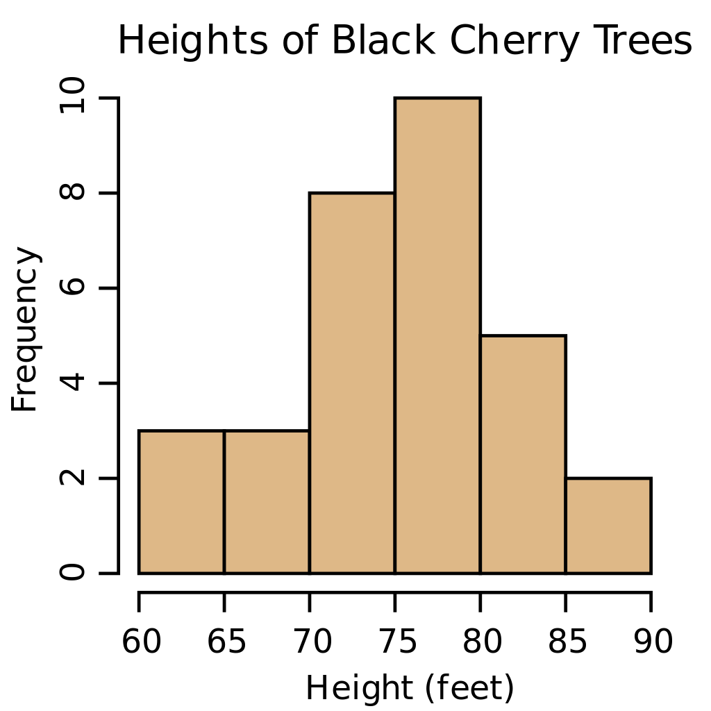
Distribution Shapes: What Do They Tell Us?
Symmetric: Data is evenly distributed around the center Skewed Left: Tail extends toward lower values Skewed Right: Tail extends toward higher values Shape affects which measure of center is most useful

Hands-On: Calculate and Compare
Work with a partner using the provided data sets Calculate mean, median, mode for both sets Find range, MAD, and IQR for both sets Compare your results - what do the numbers tell you?

Visual Comparison Tools

Critical Thinking Challenge
Two schools report the same average test score of 78. School A has a range of 15 points, while School B has a range of 45 points. What does this tell you about the two schools?

Drawing Conclusions from Data
Look for patterns in center, spread, and shape Consider overlap between data sets Use evidence from multiple measures Communicate findings clearly with data vocabulary Remember: correlation doesn't always mean causation