MathsFreePrintable
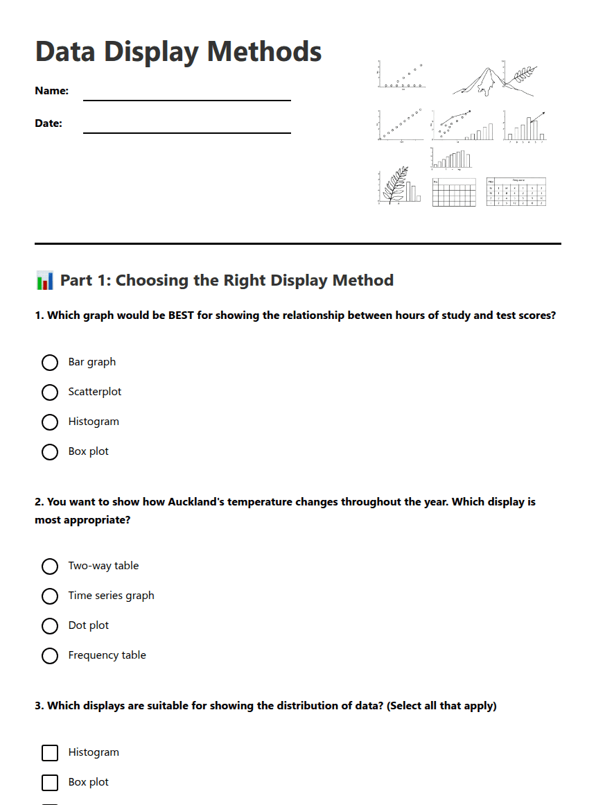
Data Display Methods
A free maths worksheet ready for your classroom. Open in Kuraplan to grab the print-ready PDF, customize it for your students, or generate a fresh version in seconds.
Data Display Methods
📊 Part 1: Choosing the Right Display Method
1. Which graph would be BEST for showing the relationship between hours of study and test scores?
Bar graph
Scatterplot
Histogram
Box plot
2. You want to show how Auckland's temperature changes throughout the year. Which display is most appropriate?
Two-way table
Time series graph
Dot plot
Frequency table
3. Which displays are suitable for showing the distribution of data? (Select all that apply)
Histogram
Box plot
Dot plot
Scatterplot
4. A researcher wants to compare the favourite sports of Year 9 boys versus Year 9 girls. The best display method would be:
Time series graph
Scatterplot
Two-way table
Box plot
📈 Part 2: Graph Analysis and Creation
5. You collect data on the heights (cm) of 30 students: 152, 155, 158, 160, 162, 162, 165, 167, 168, 170, 170, 172, 173, 174, 175, 175, 176, 177, 178, 179, 180, 181, 182, 183, 184, 185, 186, 187, 189, 192.
What would be an appropriate scale for the y-axis if creating a histogram?
6. Explain why a scatterplot would NOT be appropriate for displaying favourite pizza toppings among students.
7. A dot plot shows test scores with most dots clustered around 75-85, but three dots appear at 45, 48, and 52. What do these isolated dots likely represent?
🎯 Part 3: Real-World Applications
8. You're investigating whether there's a relationship between rainfall (mm) and ice cream sales ($) in your town. Describe what type of graph you would create and what pattern you might expect to see.
9. Complete the statement: "A box plot is particularly useful for identifying _____________ in a dataset and comparing _____________ between different groups."
A box plot is particularly useful for identifying _____________ in a dataset and comparing _____________ between different groups.
10. List three important graphing conventions you should follow when creating any statistical display.
About This Worksheet
Free in Kuraplan
Sign up free, grab the PDF, and customize it for your class.
Print-Ready
Formatted for standard paper. Clean layout, easy to read.
AI-Generated
Created with Kuraplan's AI, designed for real classroom use.
For Teachers & Parents
Use in classrooms, for homework, tutoring, or homeschool.
Need a custom version of this worksheet?
Kuraplan's AI generates custom worksheets in seconds — differentiated for every learner, aligned to your curriculum.
Generate Custom Worksheets — Free No credit card Curriculum-aligned Under 60 seconds
More Maths Worksheets
Year 4
Year 4 Maths Placement Test
Free
Year 11
Functional Skills Maths Revision
Free
Year 11–13
Functional Skills Maths Assessment
Free
Year 11–13
Functional Skills Maths Practice
Free
Year 5–7
Maths Trivia Team Challenge
Free
Year 9
Year 9 Maths Revision
Free
Year 10
Year 10 Measurement Maths
Free
Year 8–9