World Population Density — free printable diagram
Free geography resource for teachers · CC BY-NC 4.0
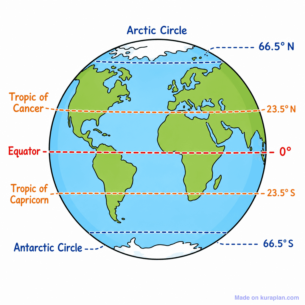
About this illustration
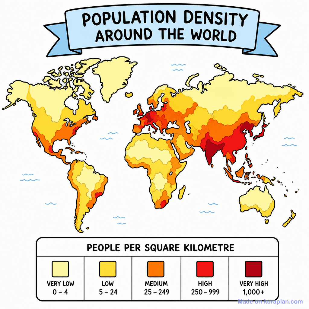
A flat illustration of a world map depicting global population density using a heat map gradient. The map is color-coded from yellow (very low density) to dark red (very high density), with a clear legend at the bottom indicating 'PEOPLE PER SQUARE KILOMETRE' for categories like 'VERY LOW 0-4' to 'VERY HIGH 1,000+'. This resource teaches world geography, population distribution, and data interpretation, suitable for introducing demographics or human settlement patterns. It is ideal for classroom slides, worksheet interpretation tasks, or as a discussion prompt for various grade levels, particularly in social studies or geography curricula.
How to use
- 1Right-click the image and choose “Save image as”, or use the download button.
- 2Use it in your classroom worksheets, slides or printables — free under CC BY-NC 4.0.
- 3Attribute as “Image by Kuraplan” or link back to kuraplan.com. Not for commercial resale.
Make worksheets with images like this
Kuraplan's editor has the full image library built in — drag-and-drop into a worksheet in seconds.
Related illustrations
More from World Maps (Thematic)
Browse by subject
18 subjects · 5,118 free illustrations
Maths
1,895 free illustrations
Cross-Curricular
835 free illustrations
Science
816 free illustrations
English
612 free illustrations
Health
200 free illustrations
social_studies
177 free illustrations
Religious Education
139 free illustrations
Music
128 free illustrations
Art
66 free illustrations
Drama
56 free illustrations
social_sciences
48 free illustrations
History
47 free illustrations
arts
26 free illustrations
pe
25 free illustrations
te_reo_maori
24 free illustrations
tech
16 free illustrations
culture
7 free illustrations
languages
1 free illustrations