Tally chart and bar graph side by side — free printable diagram
Free maths resource for teachers · CC BY-NC 4.0
About this illustration
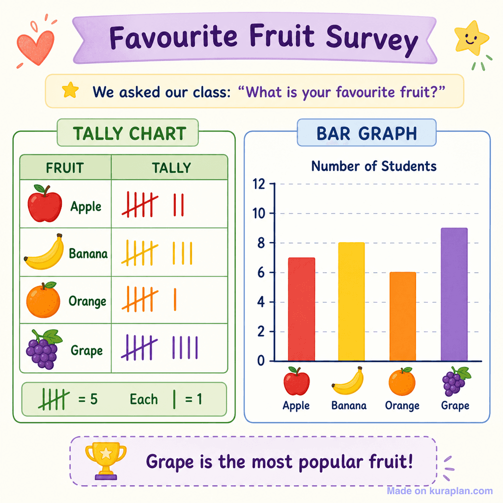
A vibrant, cartoon-style illustration presenting a 'Favourite Fruit Survey' that demonstrates data collection and representation. The image features a tally chart displaying votes for Apple, Banana, Orange, and Grape, alongside a key indicating 'H = 5' and 'Each | = 1'. Adjacent to it is a corresponding bar graph, clearly showing the 'Number of Students' on the y-axis and fruit icons on the x-axis, visually interpreting the tally data. A concluding statement, 'Grape is the most popular fruit!', highlights data analysis. This resource is ideal for slides or worksheets to teach early numeracy concepts like data handling, tally marks, and bar graph creation in primary maths lessons.
How to use
- 1Right-click the image and choose “Save image as”, or use the download button.
- 2Use it in your classroom worksheets, slides or printables — free under CC BY-NC 4.0.
- 3Attribute as “Image by Kuraplan” or link back to kuraplan.com. Not for commercial resale.
Make worksheets with images like this
Kuraplan's editor has the full image library built in — drag-and-drop into a worksheet in seconds.
Browse by subject
18 subjects · 3,773 free illustrations
Cross-Curricular
835 free illustrations
Science
816 free illustrations
English
612 free illustrations
Geography
549 free illustrations
Health
200 free illustrations
social_studies
177 free illustrations
Religious Education
139 free illustrations
Music
129 free illustrations
Art
66 free illustrations
Drama
56 free illustrations
social_sciences
48 free illustrations
History
47 free illustrations
arts
26 free illustrations
pe
25 free illustrations
te_reo_maori
24 free illustrations
tech
16 free illustrations
culture
7 free illustrations
languages
1 free illustrations