Statistics Graphs for Year 8
Exploring Different Ways to Display Data Australian Curriculum Aligned Making Sense of Numbers Through Visuals
What Are Statistical Graphs?
Visual representations of numerical data Help us understand patterns and trends Make complex information easier to interpret Essential tool for data analysis
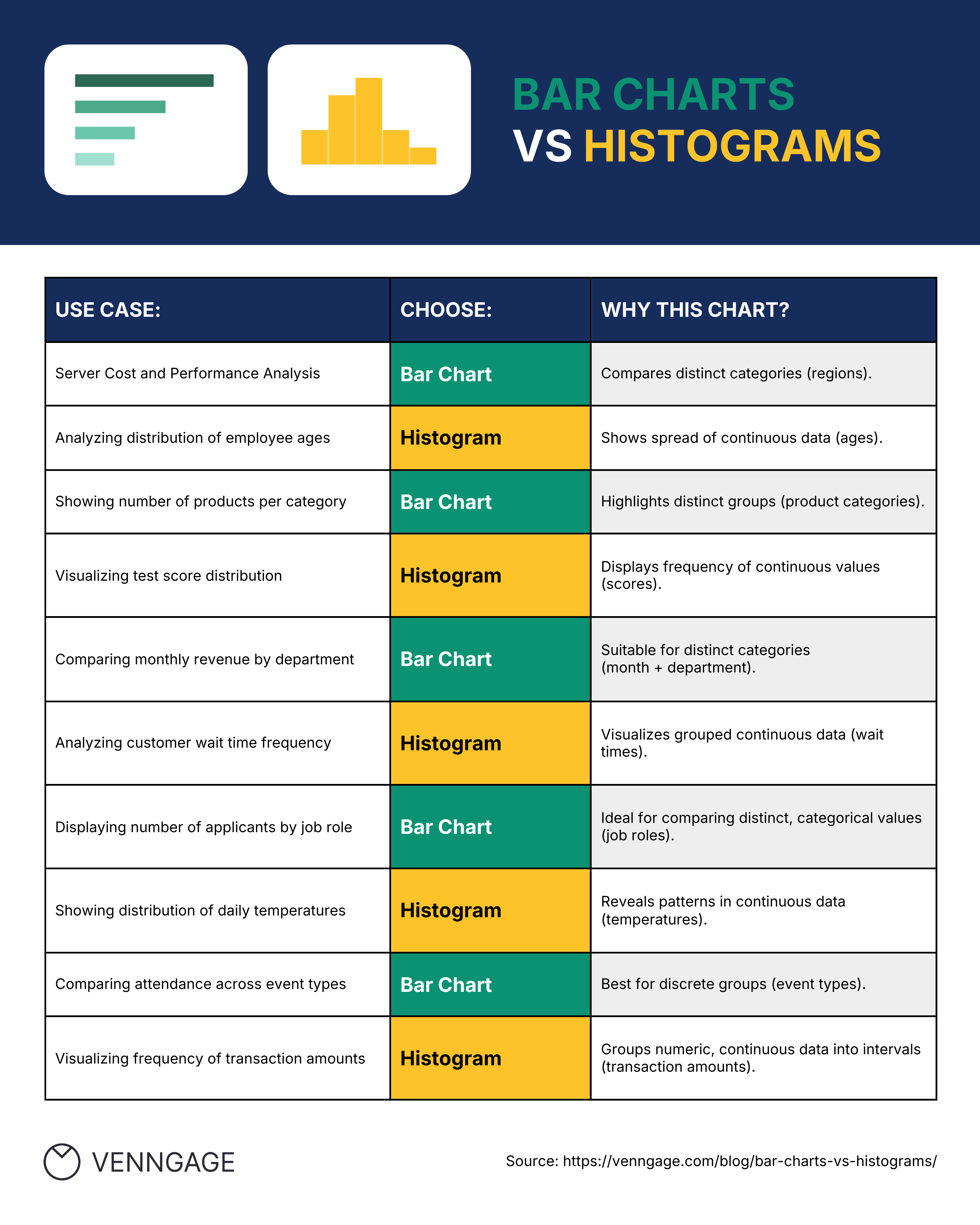
Column Graphs (Bar Charts)
Compare different categories of data Bars can be vertical or horizontal Height/length represents the value Perfect for discrete data

Create Your Own Column Graph
Survey your classmates about their favorite subjects Record the data in a table Draw a column graph showing the results What patterns do you notice?
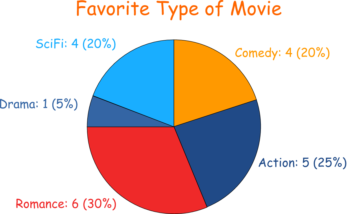
Pie Charts (Circle Graphs)
Show parts of a whole Each slice represents a percentage Total always equals 100% Great for showing proportions

Line Graphs
Show changes over time Connect data points with lines Reveal trends and patterns Ideal for continuous data

Stem-and-Leaf Plots
Choosing the Right Graph
{"left":"Categorical data (favorite colors, sports)\nComparing quantities between groups\nParts of a whole (budget breakdown)\nShowing percentages or proportions","right":"Changes over time (temperature, growth)\nTrends and patterns in continuous data\nSmall datasets with exact values\nShowing distribution and actual data"}

Think and Discuss
A class collected data on students' heights. Which graph would be most appropriate? Why might a pie chart not work for this data? What about a stem-and-leaf plot?
Key Takeaways
Different graphs suit different types of data Always label axes and include a title Choose the graph that tells your story best Practice reading and creating various graph types